PROJECT OVERVIEW
The Lingua House website serves as the central point of contact for prospective students interested in language learning opportunities. The school aims to create a seamless and satisfying educational environment that caters to the needs of students at various levels of proficiency, taking into account their individual personal and professional goals.
The Lingua House website serves as the central point of contact for prospective students interested in language learning opportunities. The school aims to create a seamless and satisfying educational environment that caters to the needs of students at various levels of proficiency, taking into account their individual personal and professional goals.

8+
WEEKS
30+
SCREENS
20+
SURVEYS
25+
COMPONENTS
USER PROBLEMS
Complicated Navigation Menu
Users may struggle to find relevant information due to convoluted website navigation, leading to frustration and disengagement.
Inconsistent Content Presentation
Users may experience confusion or difficulty understanding information if it's inconsistently presented across different sections of the website, leading to a disjointed user experience.
Outdated Design
The website's outdated design may create a perception of unprofessionalism and detract from user engagement and trust.
Inadequate Course Information
Users may feel hesitant to enroll in courses due to insufficient details about course content, instructors, or learning outcomes, impacting their decision-making process.


POSSIBLE SOLUTION
Streamlined Navigation Menu
Introduction of a simplified and intuitive navigation menu with clear labels and categories to help users easily locate the information they want, thereby reducing frustration and increasing engagement.
Unified content style guide
Develop and consistently follow a unified content presentation style guide across all sections of the site, ensuring a consistent and seamless user experience.
Revitalized Website Design
Enhance the website with a fresh design approach and intuitive interface to reinforce professionalism and encourage greater user interaction and confidence.
Expanded Course Descriptions
Expand course listings by including detailed descriptions of course content, instructor qualifications, learning objectives, and potential career outcomes to provide users with a comprehensive understanding of each course offering.
my roles and responsibilities
user persona
user flow
wireframe
UX/Ui design
design thinking process
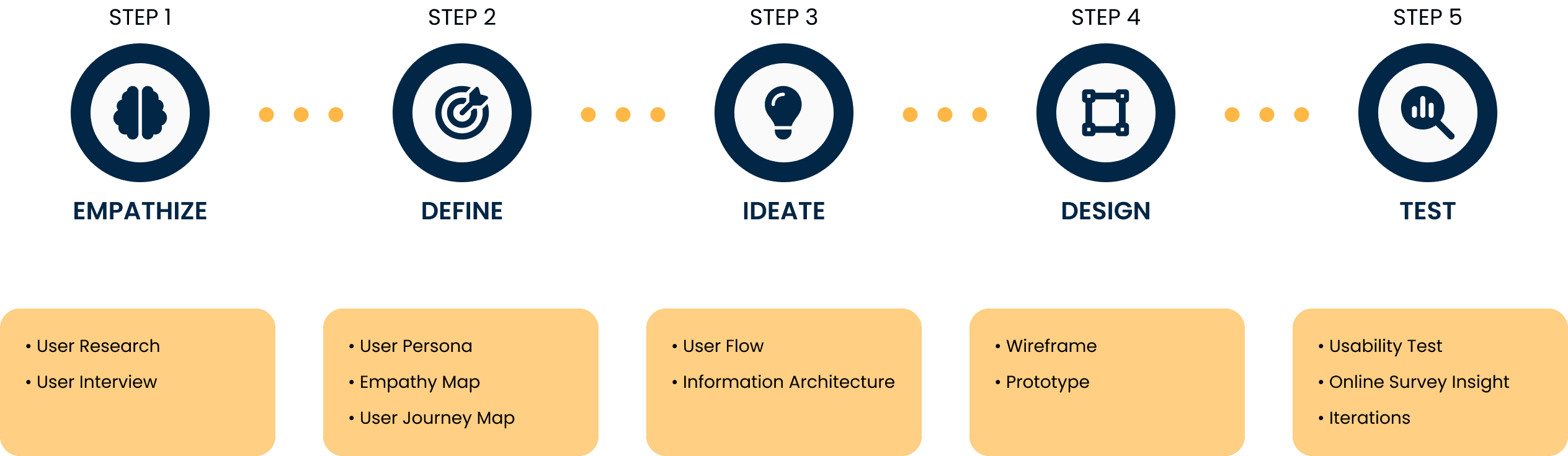
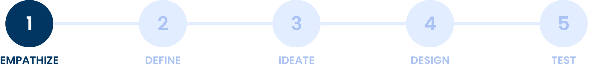
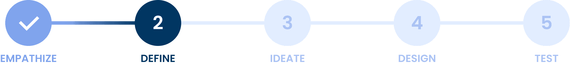
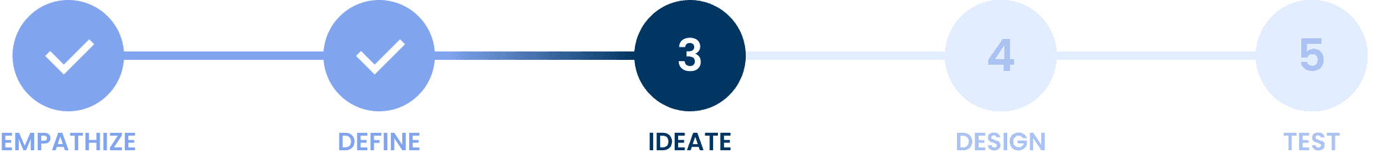
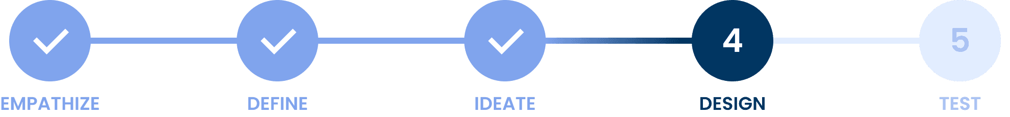
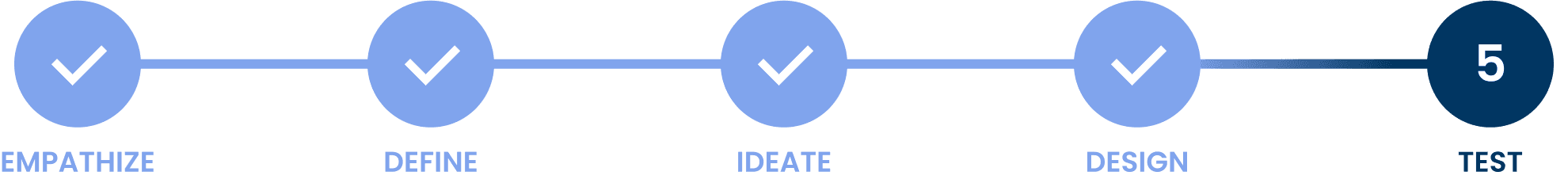
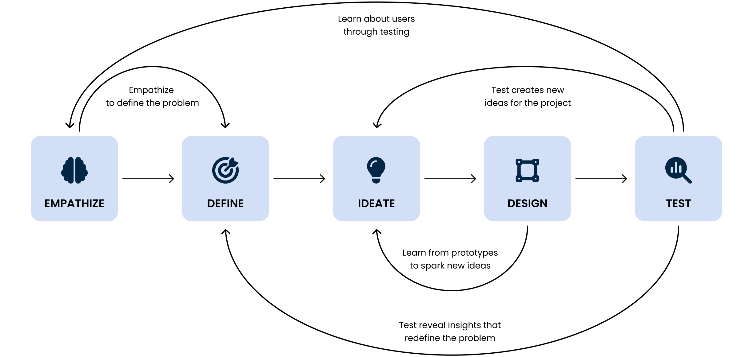
While redesigning the Lingua House website, I used a five-step Design Thinking Process. This approach enabled me to empathize with users, define their needs, design innovative solutions, prototype designs, and finally test and iterate to ensure an optimal user experience. By following this iterative and user-centered methodology, I aimed to create a website that truly resonates with users and effectively addresses their needs.
user research
User research is crucial for the Lingua House website redesign, providing valuable insights into user behaviors and needs. Through surveys, interviews, and usability testing, I aim to understand user interactions with the current site, identify pain points, and inform improvements. This research ensures that the redesigned website meets user expectations, enhancing the overall user experience.
user interview
User interviews are an integral part of my approach to redesigning the Lingua House website, providing me with invaluable insight into the perspectives and experiences of the target user group. Through one-to-one conversations with language learners, I can better understand their preferences, challenges, and needs regarding the website. These interviews allow me to gather valuable feedback and identify specific issues. By listening to users' voices, I can adapt the redesigned website to better meet their expectations and requirements, ultimately enhancing their overall experience.
Qualitative research
Individual In-depth Interview
While browsing the Lingua House website, what information or features are most important to you, and what do you most commonly search for? Is there any feature or information that is missing from the website that you would like to see?
What has been your experience with navigating the Lingua House website? Do you encounter difficulties in finding the necessary information?
Have you ever used the search function on the Lingua House website? What were you looking for? What are your experiences with this tool?
Does the Lingua House website provide an adequate amount of information about the offered language courses, teaching programs, or teaching methodologies?
Does the presence of visual media, such as photos or videos, on the Lingua House website help you better understand the educational offerings?
Have you used any interactive features on the Lingua House website, such as contact forms or downloadable materials? If so, can you share your experiences with using them? Do you find them easy to use?
Are there any features on the Lingua House website that distinguish it from other websites offering language courses? Has anything specific caught your attention or made an impression on you?
What is your overall impression after browsing the Lingua House website? Did the website meet your expectations? Were you able to easily find the necessary information?
key insights from the interviews
Difficulties in Website Navigation
Navigation difficulties emerge as a common issue among users, with some struggling to locate the required information swiftly. This suggests a need for improved website navigation to enhance the user experience and streamline information retrieval.
Essential Information Priority
Users prioritize clear access to essential details and features while browsing the Lingua House website, such as course specifics, teaching methodologies, and program offerings. Many express interest in additional details, like the teaching method for a specific course or information about the teacher.
Chaotic Website Structure and Trust Issues
Feedback reveals that users perceive the website's structure as chaotic, leading to a lack of trust in its reliability. This sentiment extends to functionalities such as contact forms or payment processes, where users express reluctance to engage due to concerns about security or usability.
Outdated Website Design
The outdated appearance of the Lingua House website is also an important point of criticism among users. The lack of modern design makes the site seem neglected and unattractive. The absence of contemporary graphic elements and functionalities negatively affects users' perception of the brand, suggesting neglect in the school's online image.
Quantitative research
Key insights from the online surveys
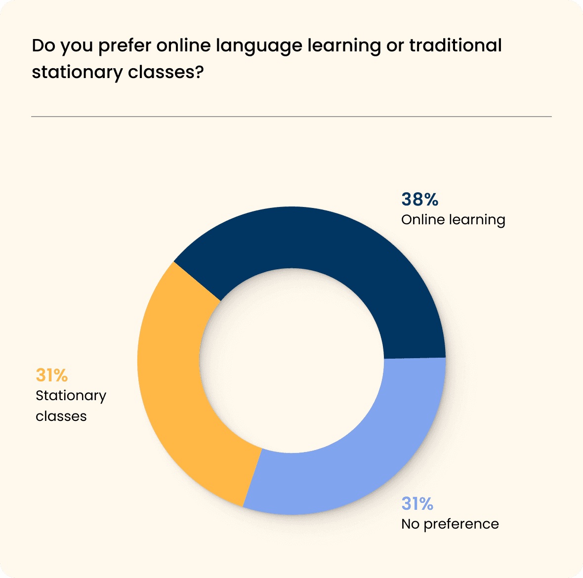
Online Learning Preference
A significant majority (38%) of respondents prefer online language learning over traditional stationary classes, indicating a growing preference for flexible and remote learning options.
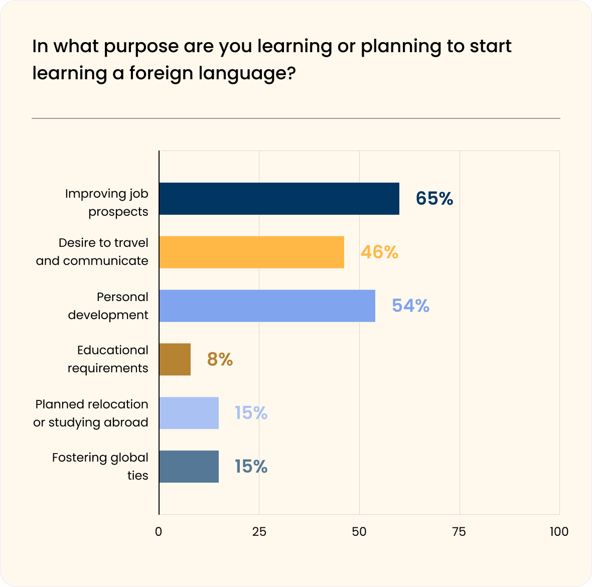
Motivations for Learning
The primary motivations for learning or planning to start learning a foreign language are improving job prospects (65%) and personal development (54%), suggesting a strong emphasis on practical applications and self-improvement.
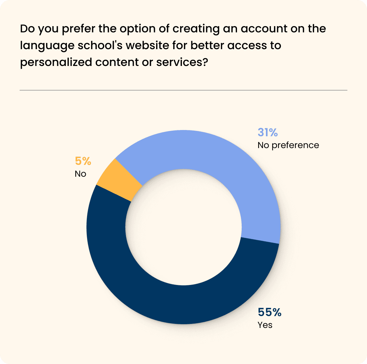
Preference for Account Creation
A majority (55%) of respondents prefer the option of creating an account on the language school's website for better access to personalized content or services, highlighting the importance of tailored experiences for users.
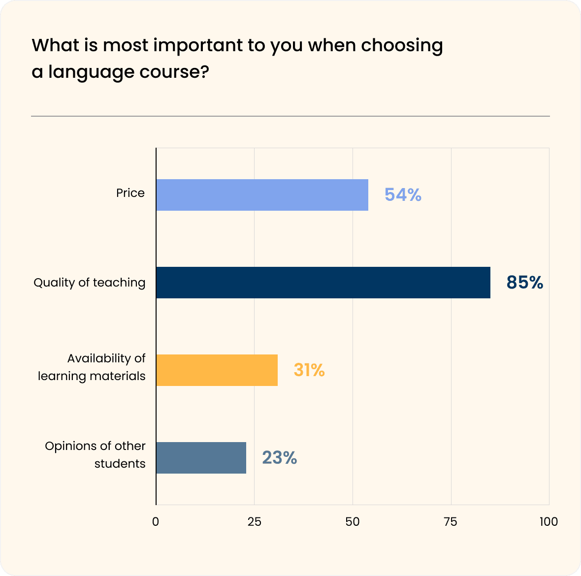
Emphasis on Teaching Quality
The overwhelming majority (85%) prioritize the quality of teaching when choosing a language course, indicating that instructional excellence holds significant weight in the decision-making process.
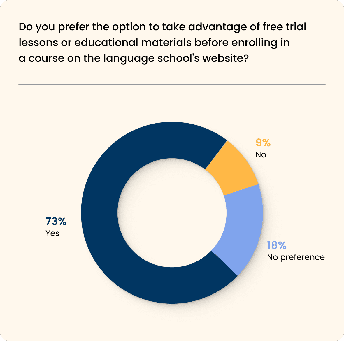
Demand for Free Trials
A substantial majority (73%) prefer the option to take advantage of free trial lessons or educational materials before enrolling in a course, underscoring the importance of hands-on experience and the value of sampling offerings before committing.
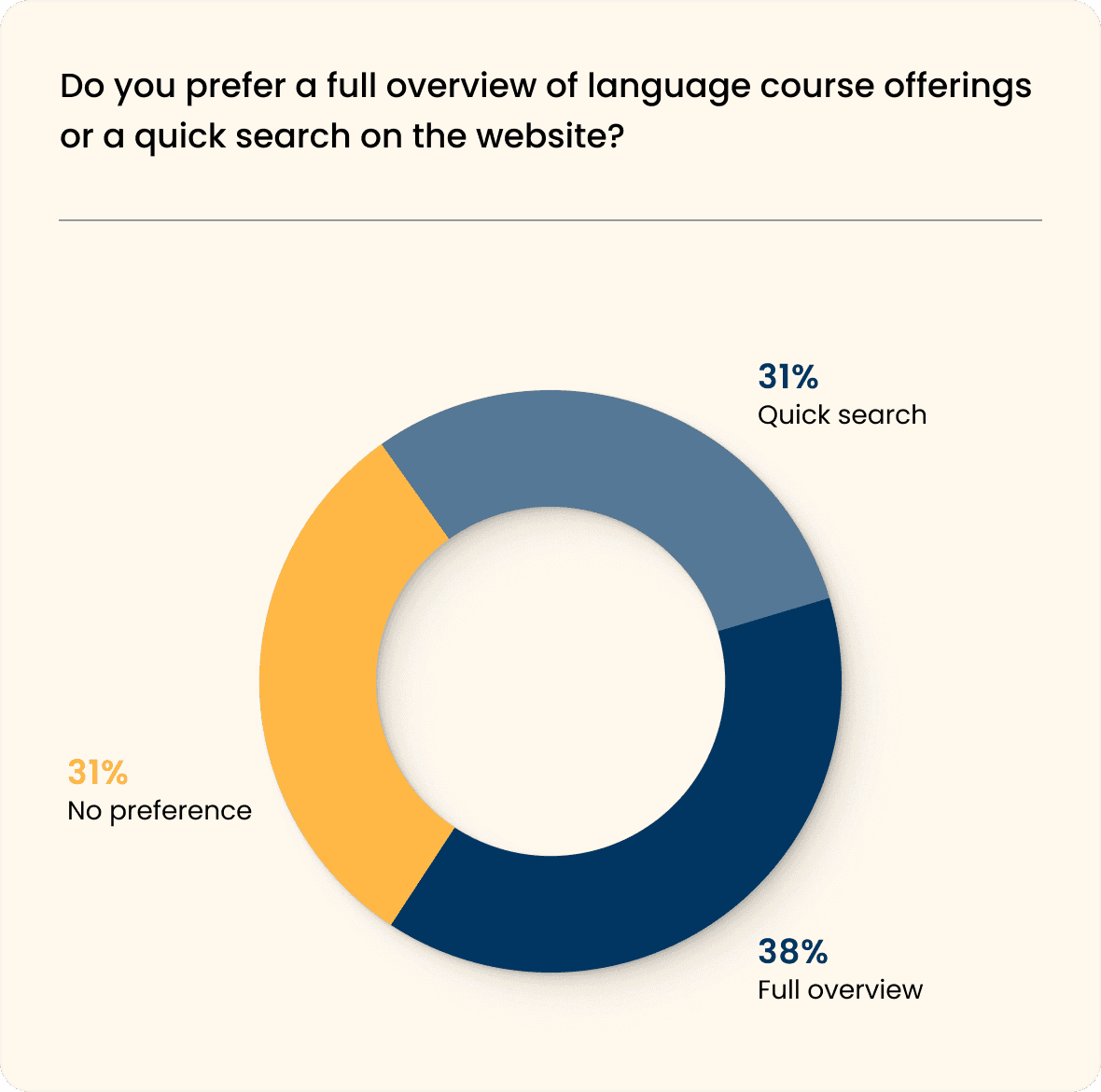
Need for Course Overview
While 38% prefer a full overview of language courses for comprehensive information, others may favor a quick search option, highlighting the importance of balancing detail with efficiency.
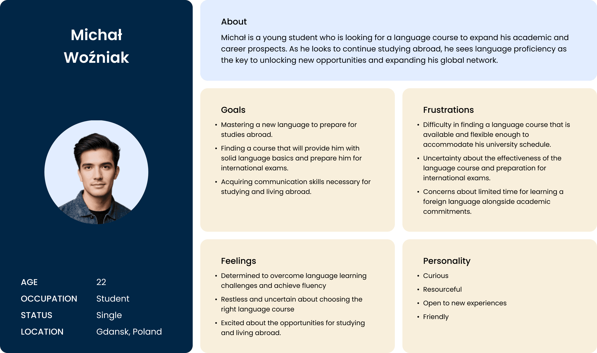
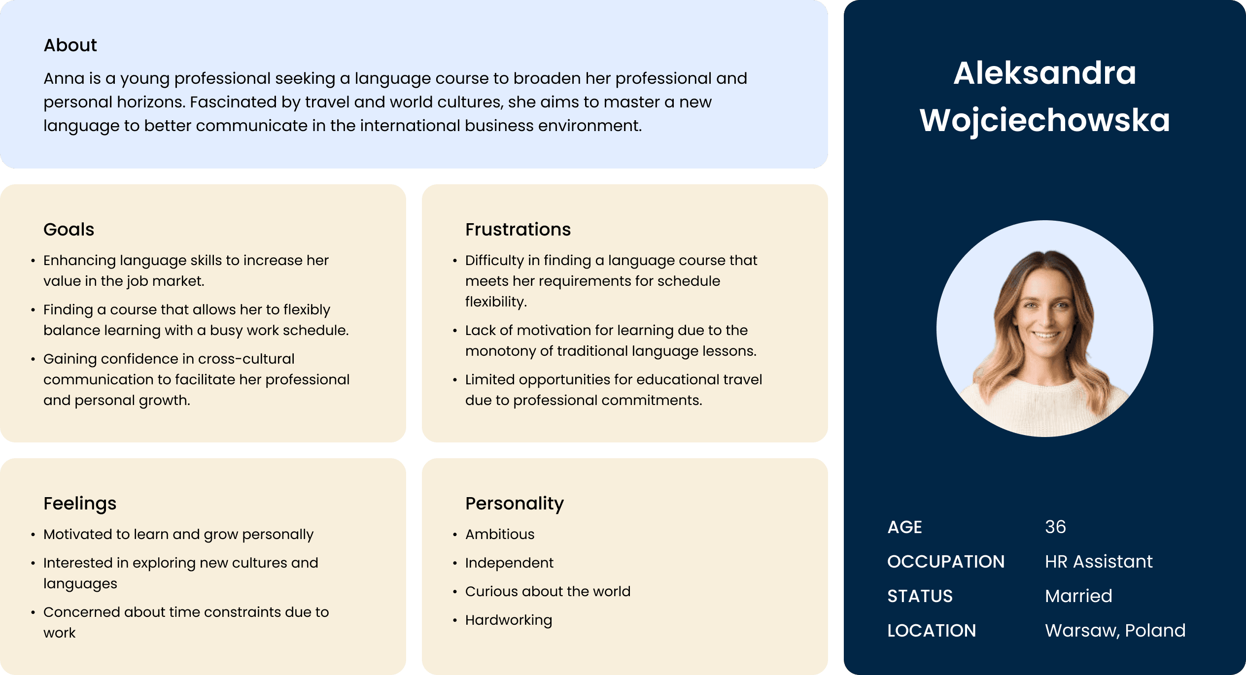
user persona
Creating user personas is a vital step in my process of redesigning my Lingua School website, allowing me to focus on user needs. By creating fictional representations based on real data from interviews and user research, I develop personas that embody key characteristics, including the goals and frustrations of the audience.
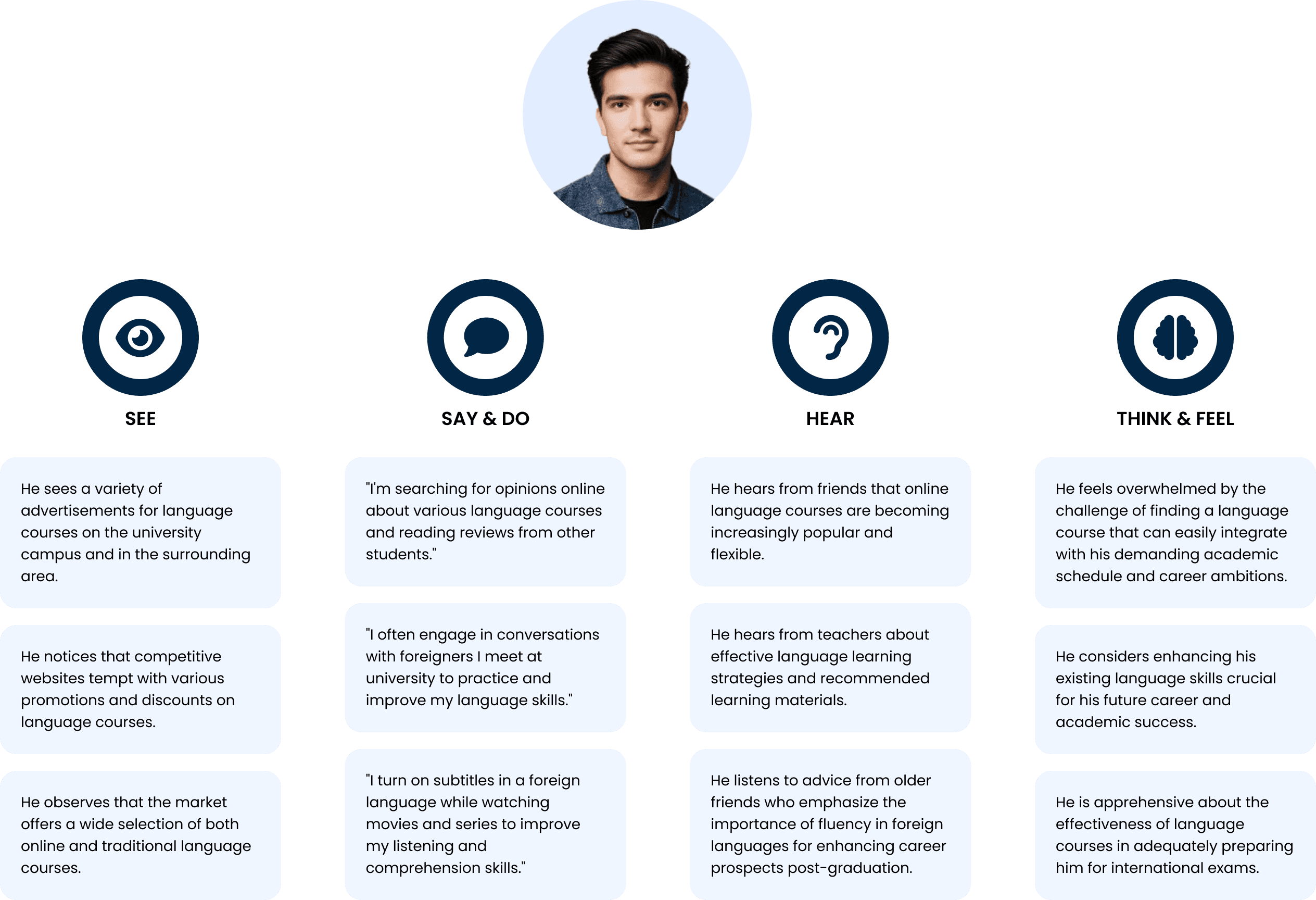
empathy map
By implementing the empathy map into my process of redesigning the Lingua House website, I am able to delve into the users' perspective through analyzing their statements across various categories. By capturing what users see, say, do, hear, think, and feel in the context of using the website, I can better understand their needs and expectations. This approach allows me to tailor the project to the users' actual needs and preferences, resulting in the creation of a website that effectively addresses their needs and expectations.
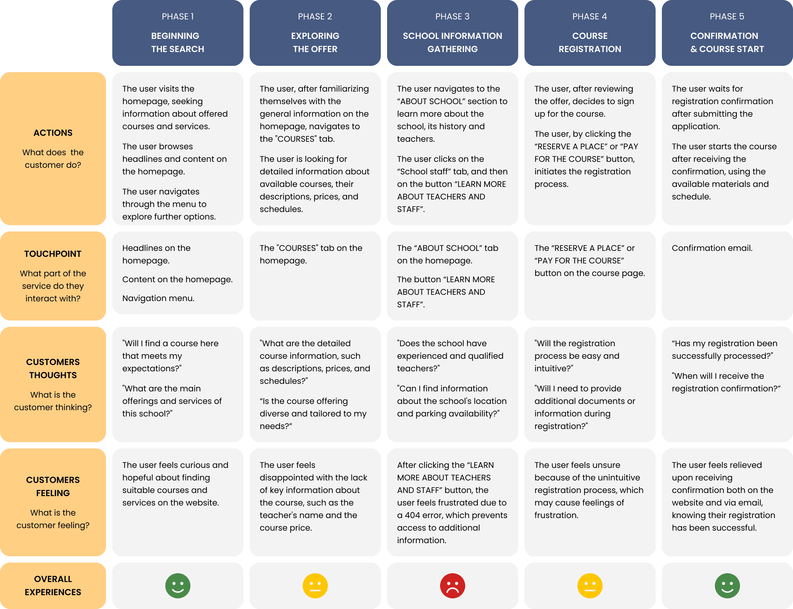
user journey map
Creating a user journey map is another essential step in my redesign process for the Lingua House website. Drawing insights from the current site, I develop these maps to pinpoint where users encounter issues and frustrations while navigating the platform. These maps provide a comprehensive overview of user interactions, encompassing emotional responses and specific actions taken. By analyzing these journey maps, I can identify potential pain points and areas for improvement, enabling me to refine the interface to better meet user needs and enhance their overall experience.
user flow
Creating a user flow is an integral part of redesigning the Lingua House website. This process involves mapping out the anticipated journey of users through the new site, from their initial entry point to the completion of key tasks. By visualizing this flow, I can anticipate potential obstacles and optimize the site's structure and navigation to ensure a seamless user experience.
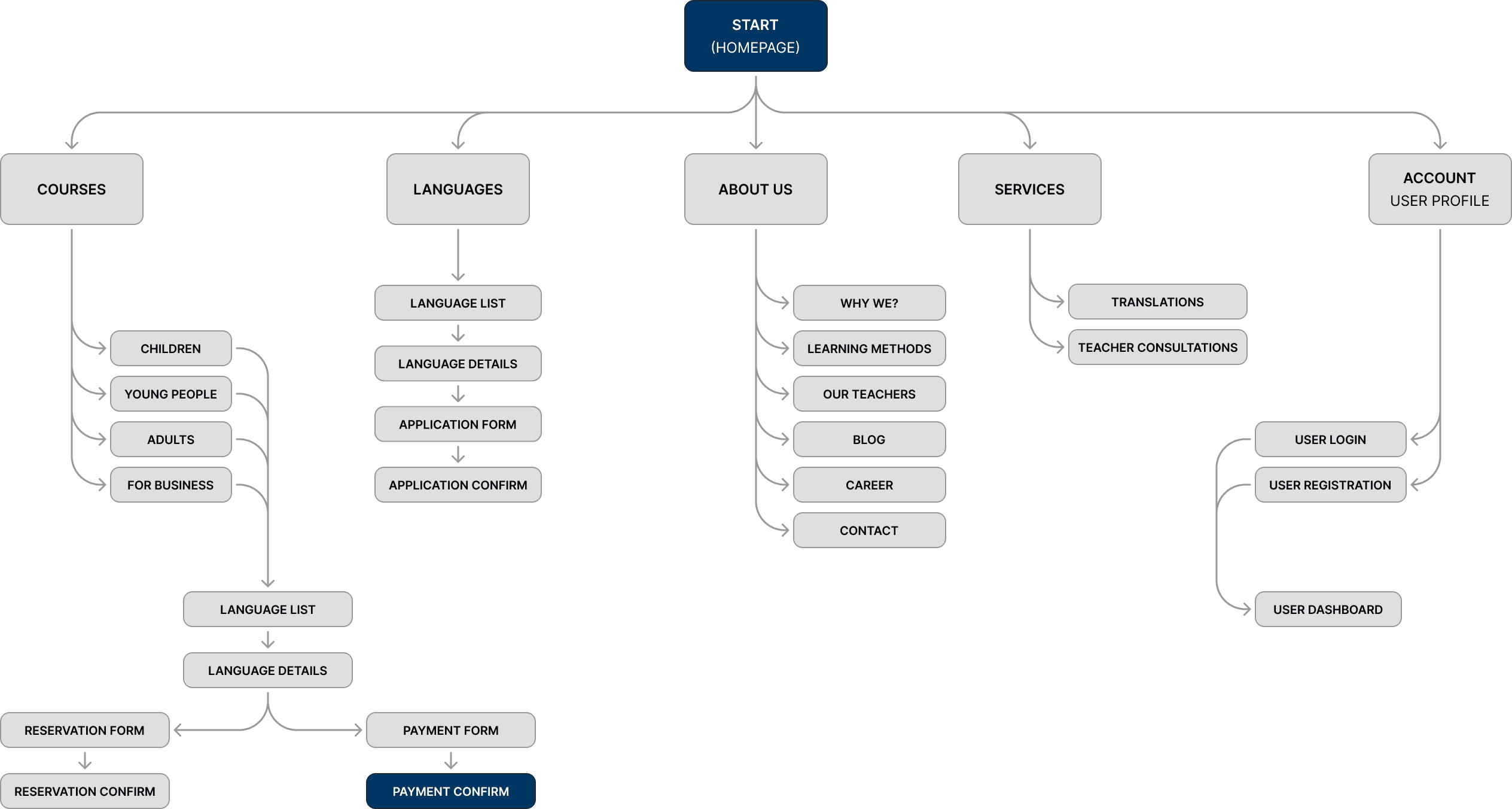
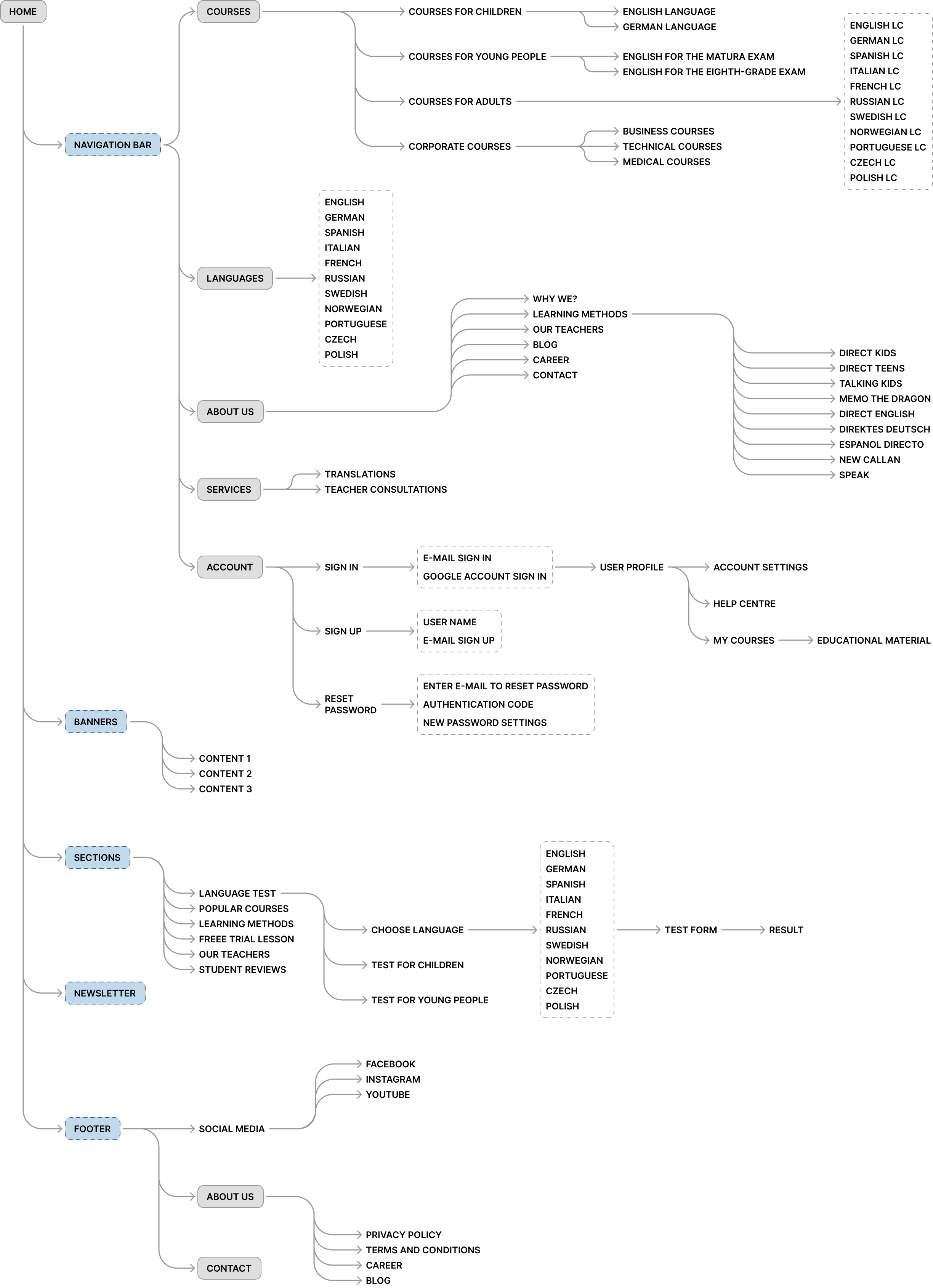
information architecture
Developing the information architecture for Lingua House is vital for a better user experience. It involves organizing content strategically for easy navigation and access. Through careful categorization and hierarchy, the redesigned architecture aims to simplify resource access, ensuring clarity for language learners.
user journey map
Creating a user journey map is another essential step in my redesign process for the Lingua House website. Drawing insights from the current site, I develop these maps to pinpoint where users encounter issues and frustrations while navigating the platform. These maps provide a comprehensive overview of user interactions, encompassing emotional responses and specific actions taken. By analyzing these journey maps, I can identify potential pain points and areas for improvement, enabling me to refine the interface to better meet user needs and enhance their overall experience.
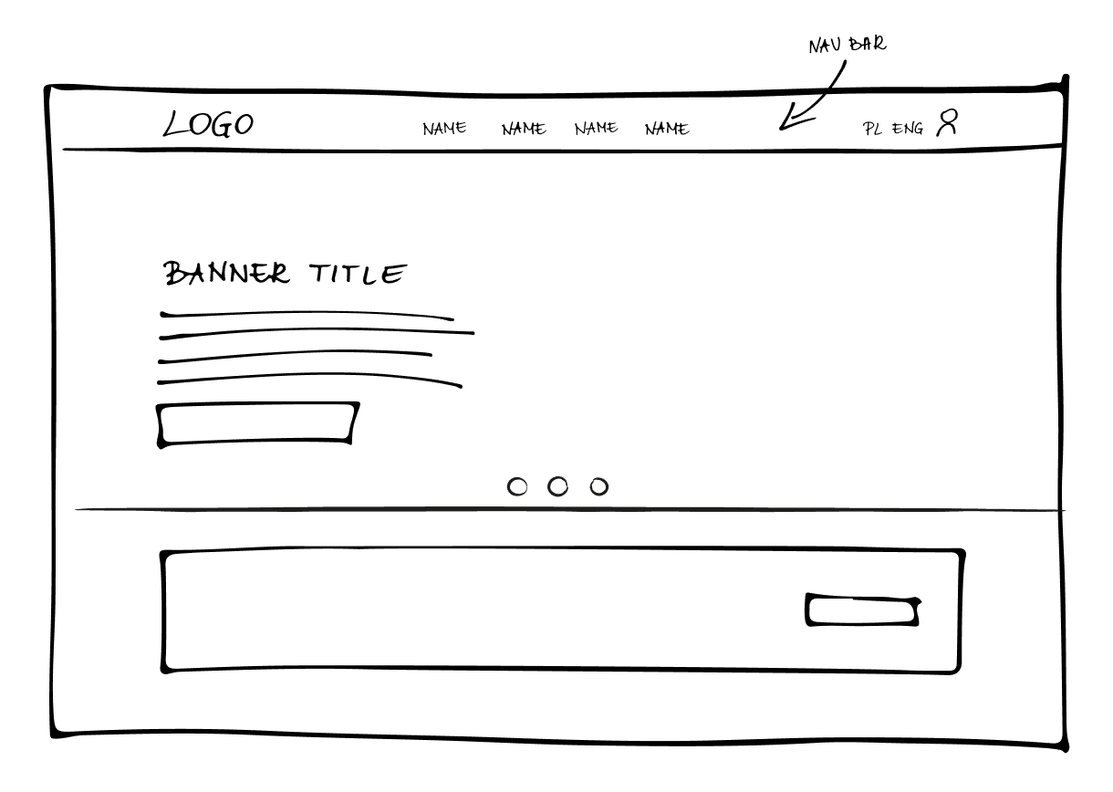
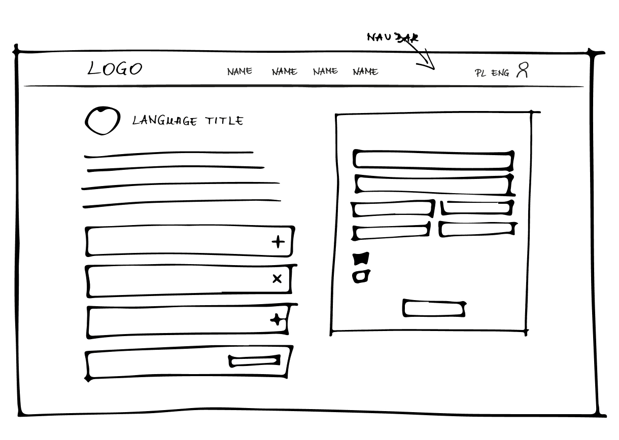
wireframeS
In this section, I present a variety of wireframes, encompassing both low and high fidelity versions, meticulously developed during the redesign process for the Lingua House website. These wireframes provide a detailed outline of the site's layout and functionality, including advanced views to effectively demonstrate the proposed design direction.
mid fidelity wireframeS
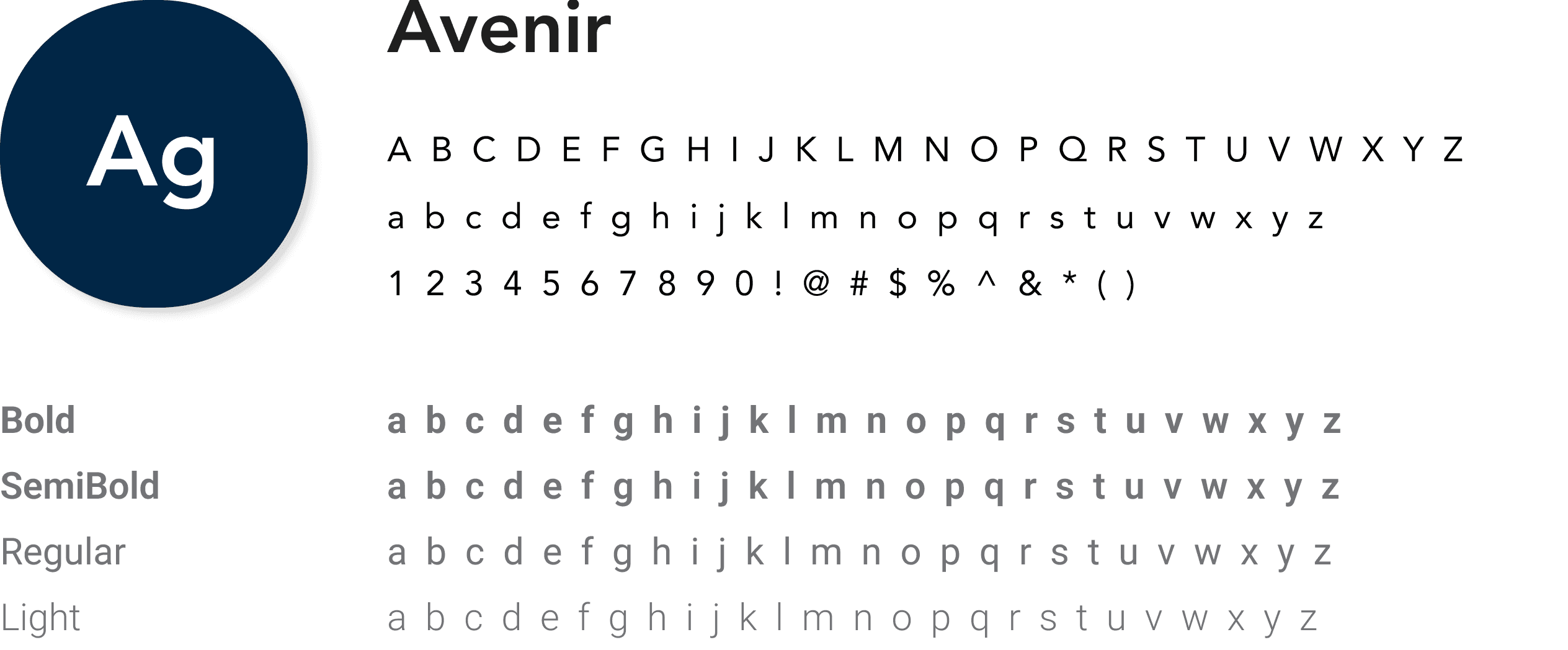
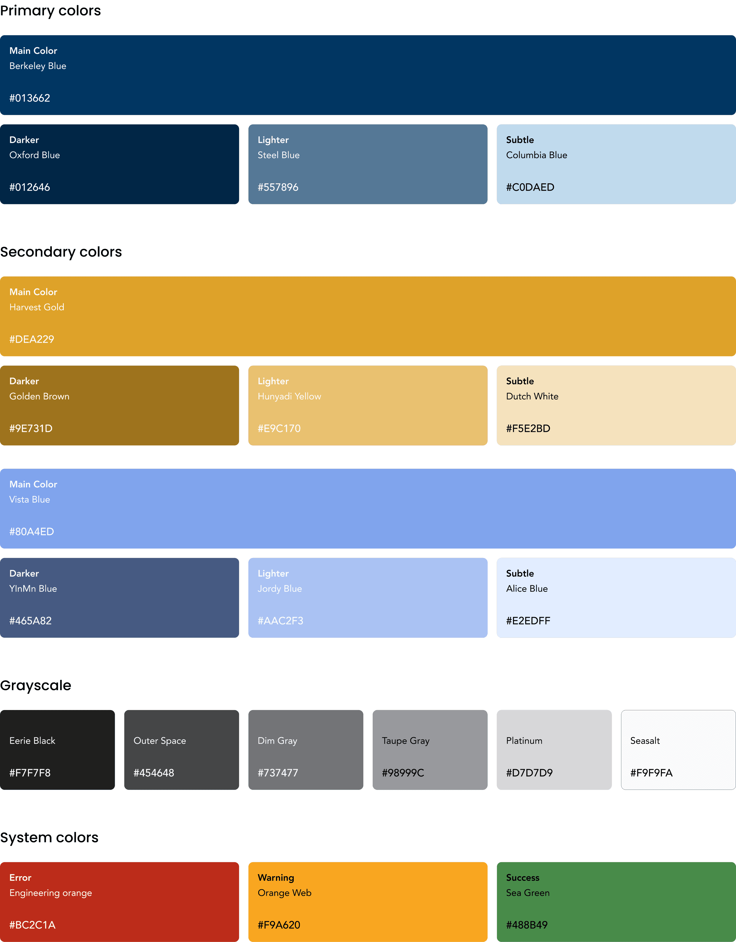
In this section, I present the development of a comprehensive design system for the Lingua House website redesign. The design system encompasses a set of guidelines, components, and assets that ensure consistency and uniformity across all aspects of the user interface. It outlines typography, color palettes, iconography, and other visual elements, facilitating efficient collaboration and seamless implementation throughout the design process.
Buttons
Filled
Button
Button
Button
Outlined
Button
Button
Button
Text
Button
Icons
Chips
Label
Label
Text Fields
Label*
Label*
Input
Label*
Input
Cards
6 - 8
Stacjonarnie

Język angielski
poziom B1
Sprawdź ofertę
Progress bar
Text
Text 1/10
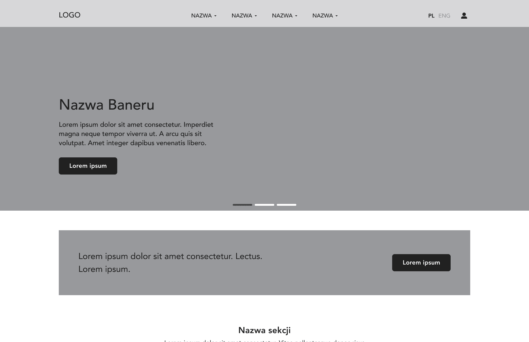
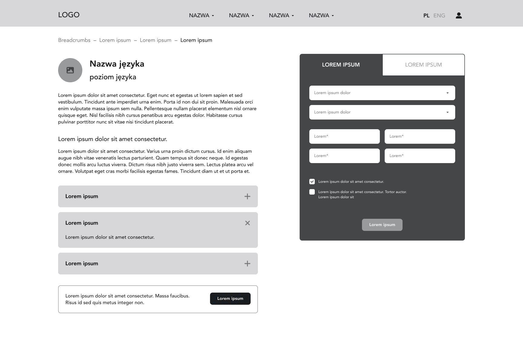
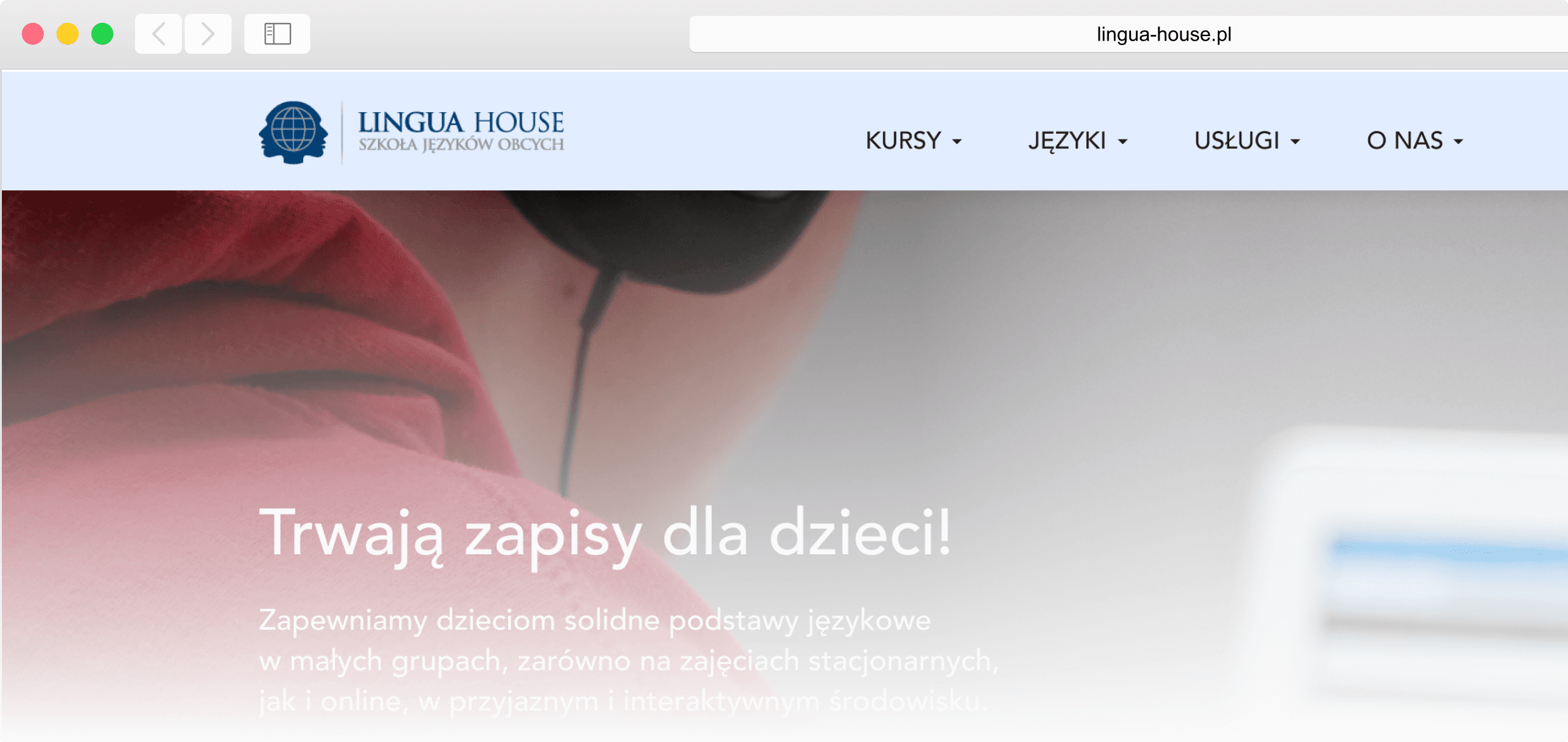
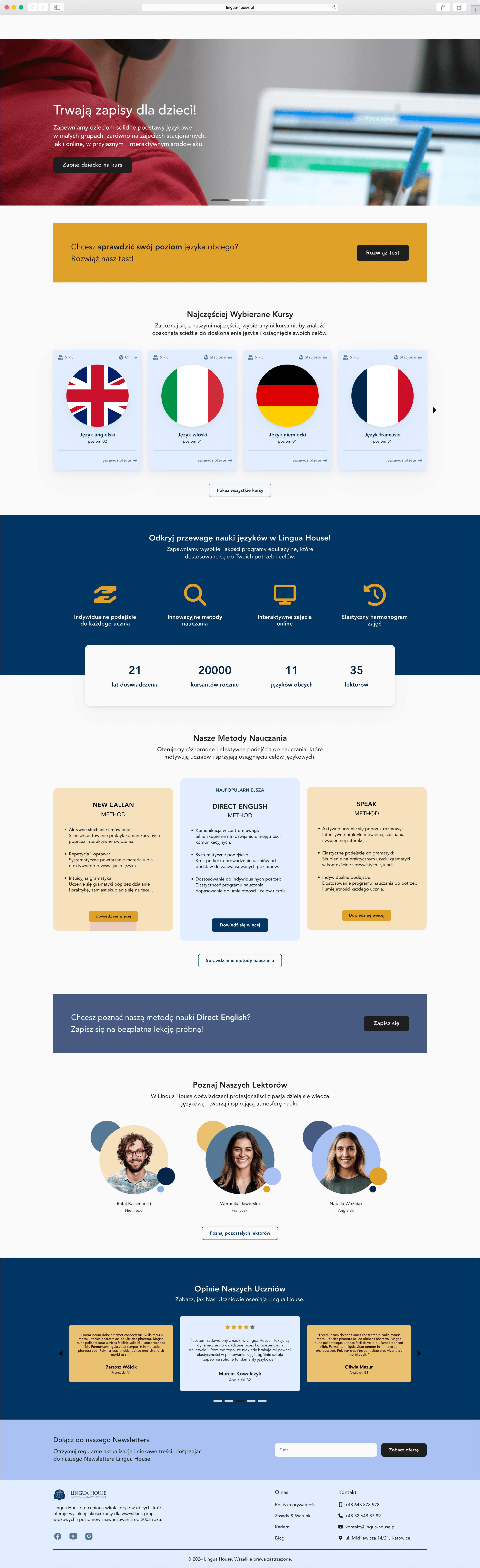
high fidelity wireframes
Streamlined navigation menu
Introduction of a simplified and intuitive navigation menu with clear labels and categories to help users easily locate the information they want, thereby reducing frustration and increasing engagement.
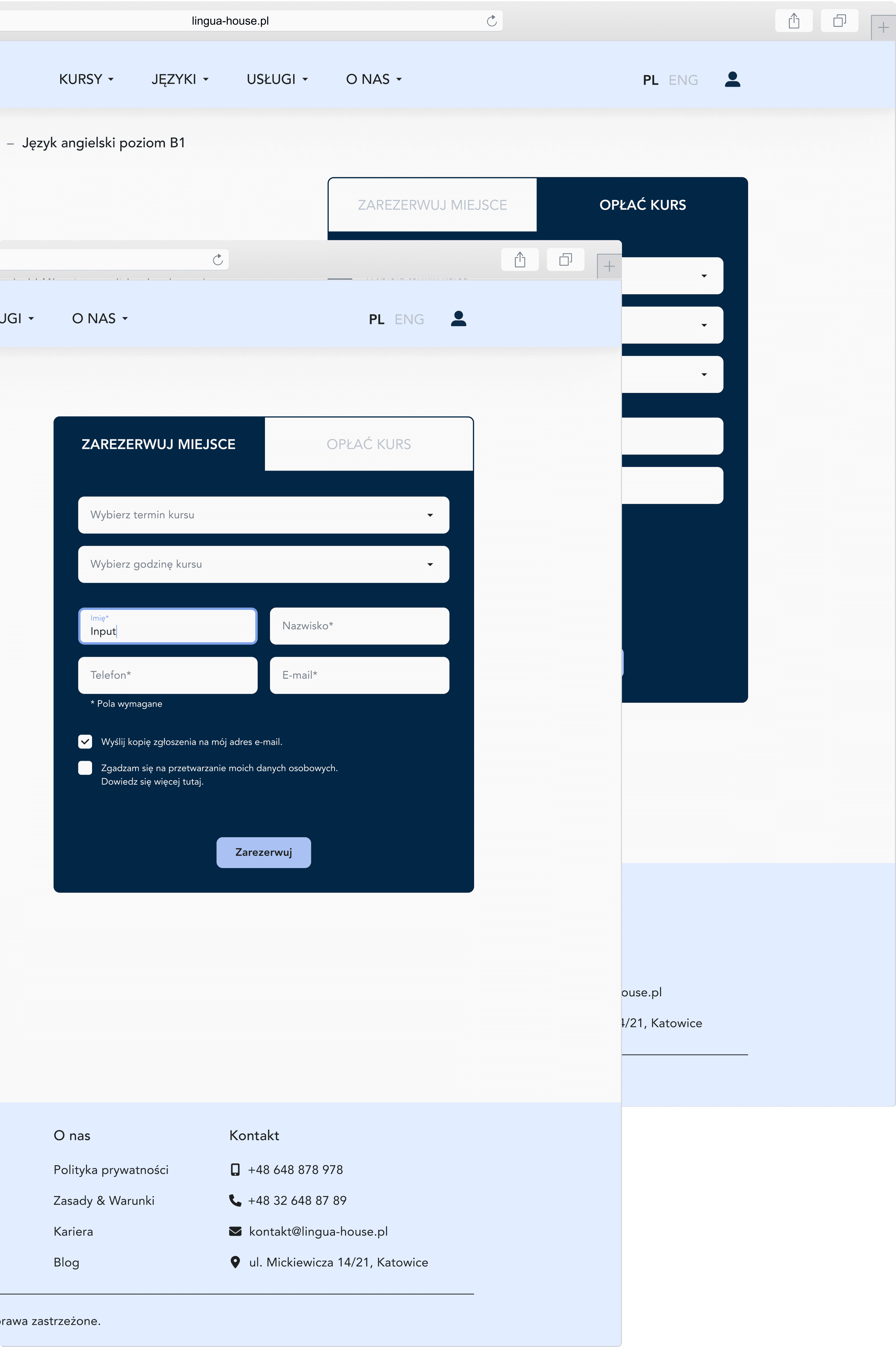
Clear booking and payment form
Implemented a user-friendly booking and payment form featuring clear instructions, intuitive input fields, and visible error messages to guide users through transactions seamlessly, thereby reducing abandonment rates and enhancing overall user experience.
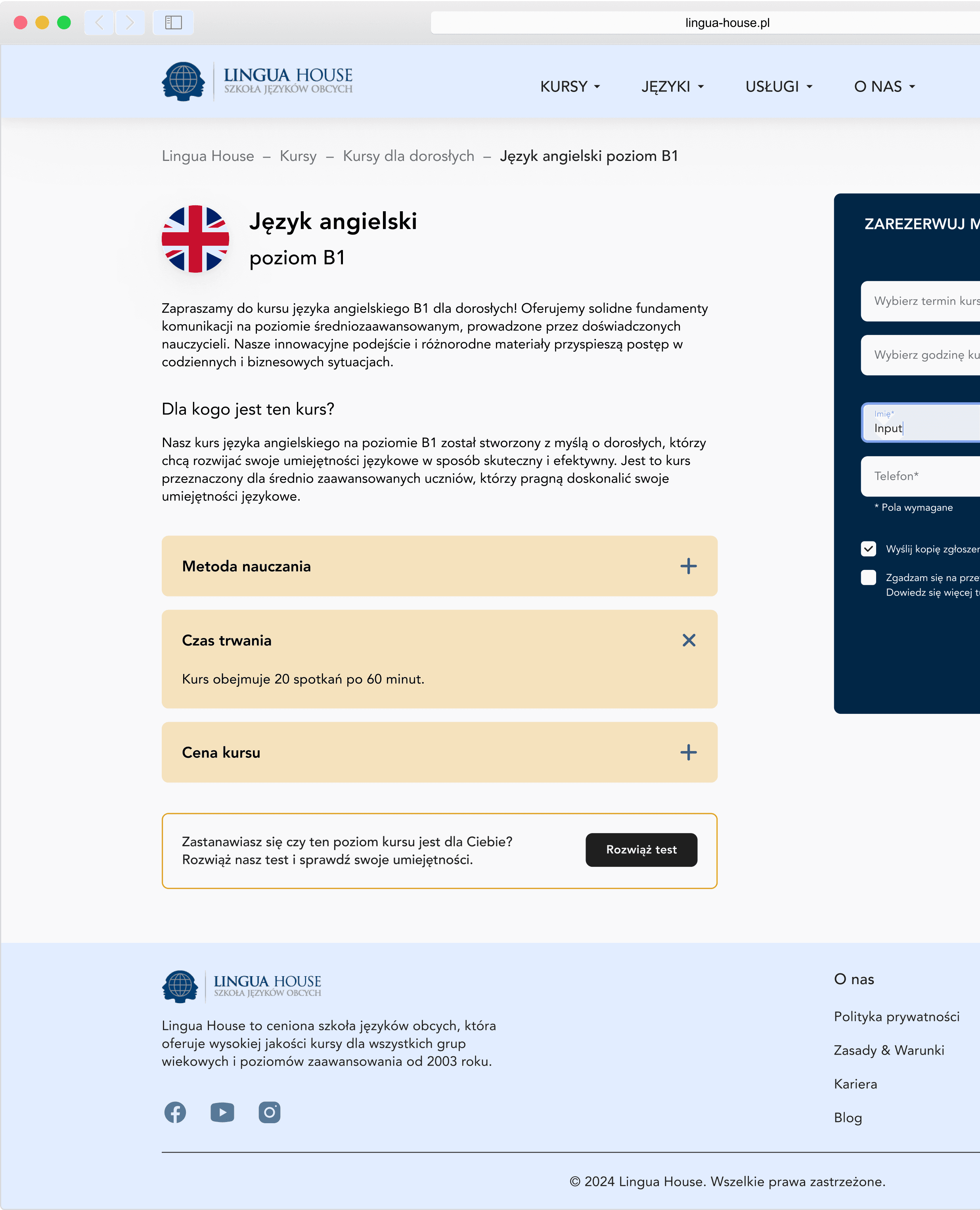
Expanded course descriptions
Expanded and enriched course descriptions extensively to provide comprehensive details, helping users make informed decisions and improving conversion rates effectively.
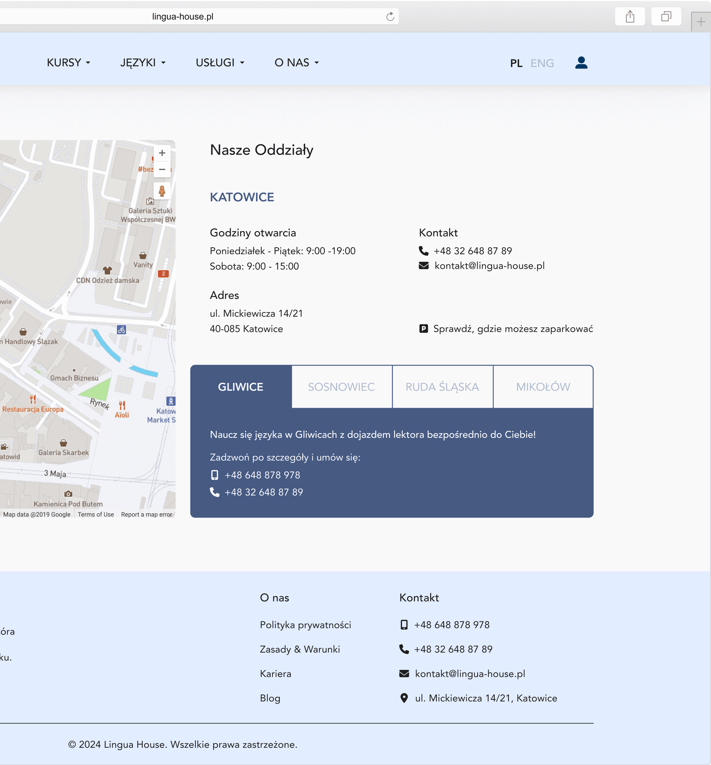
Contact subpage
Created a dedicated contact subpage with multiple contact options and a map integration for easy location reference, facilitating better communication and trust-building.
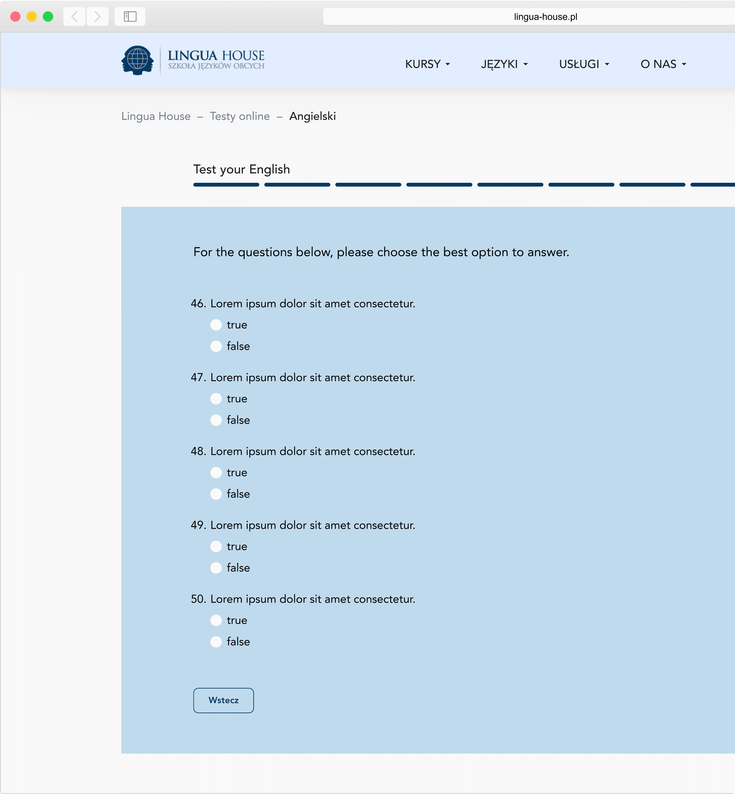
Language proficiency test
Updated the language proficiency test on the website with a user-friendly progress bar. Users receive tailored feedback to guide them to suitable language courses and resources.
Footer
Introduced a footer with essential sections such as “About us”, “Contact”, and social media icons, effectively enhancing navigation, user engagement, and reinforcing school credibility.

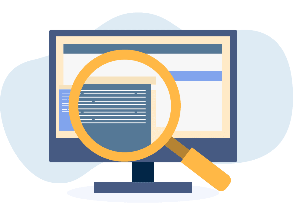
usability test
In the final stage of the redesign process, I conduct usability tests on the Lingua House website project to thoroughly examine and analyze how users interact with the user interface. This invaluable process enables me to gather comprehensive feedback on the effectiveness of the design and pinpoint specific areas requiring further optimization and enhancement.
task assigned
Reserve a place for the selected language course.
Find student testimonials about their learning experiences.
Find information about the online learning options available.
Register for a free trial lesson.
Register for a course adapted to your language proficiency level.
Find information about the language course teachers.
Contact the office for additional information about the courses.
Find the section with frequently asked questions (FAQ) about language courses.
feedbacks
Prominent Online Learning Information
Users struggled to find information about online learning options. Detailed information about virtual courses needs to be more easily accessible, preferably through a separate tab or a visible banner on the homepage.
Improving registration for a free trial lesson
Some users encountered difficulties while attempting to register for a free trial lesson. The registration process should be simplified by minimizing form fields and providing clear guidance throughout the process.
Usability of FAQ Section
Users expressed frustration with the difficulty of finding the section containing frequently asked questions (FAQ) about language courses. Additionally, users reported having trouble finding a helpful question within the FAQ section.
Teacher Information
Users had difficulty obtaining detailed information about the teachers leading language courses. They also noticed a lack of information about which teacher conducts individual classes.
What have I learned from this case study?
5 Steps of the Design Thinking Process
Working on this case study, I delved into the steps of the Design Thinking Process. Understanding its iterative and flexible approach allowed me to freely revisit previous steps to further refine the project. Becoming aware of this flexibility enabled me to explore various solutions and iteratively improve them, resulting in better outcomes and solutions.
Data and User Analysis
Through working on this case study, I've learned the importance of thorough data analysis and understanding user needs. This process has allowed me to better tailor projects to users' real expectations and identify areas for further improvement.
Reflection and Self-Development
Analyzing this project allowed me to gain a thorough understanding of its strengths and areas requiring improvement. By evaluating the design process and its outcomes, I was able to draw valuable insights that will aid me in refining future projects. This has provided me with a better understanding of the effectiveness of various design strategies and techniques, contributing to the continuous development of my skills as a UX/UI designer.
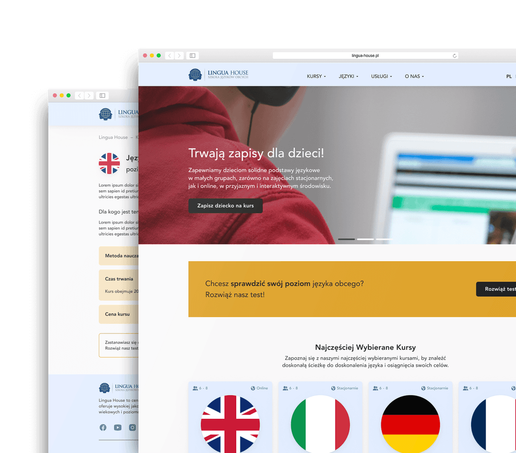
comparing projects
At the conclusion of this design process, I offer a side-by-side comparison between the original and redesigned versions of the Lingua House website. The comparison underscores the improvements introduced during the redesign process, showcasing how user feedback and user-centric design have enhanced the usability and overall functionality of the website.
BEFORE
AFTER

Thank you for your time and exploration!